You open Apple Health, scroll to Heart Rate Variability, and see a number like 38ms. It was 52ms last week. You have no idea if that’s good, bad, or whether to care.
Here’s what’s actually going on.
What HRV is
HRV stands for Heart Rate Variability. It measures the variation in time between each heartbeat, in milliseconds.
Your heart doesn’t beat like a metronome. Even at rest, the gap between beats shifts slightly. A heart that varies more between beats is generally more adaptable — it responds better to whatever your body needs next. A heart beating with rigid, clockwork timing is usually a sign your nervous system is under strain.
HRV reflects your autonomic nervous system — the part that runs without you thinking about it: breathing, digestion, stress response. When HRV is high, your body is relaxed and recovered. When it’s low, something is taxing your system.

How Apple Watch measures it
Apple Watch tracks HRV using a metric called SDNN — the standard deviation of the gaps between heartbeats, measured in milliseconds.
It also samples passively throughout the day, whenever you’re still. But this passive data is noisy and unreliable. The readings are influenced by movement, time of day, body position, and dozens of other variables. The scattered dots you see in Apple Health across a day don’t reflect your actual HRV state — they’re automated snapshots taken under inconsistent conditions.
One other thing worth knowing: Apple Watch uses SDNN, while most other wearables use RMSSD. Both measure HRV, but they produce different numbers. Your 38ms on Apple Watch and a friend’s 45ms on Garmin aren’t directly comparable. They’re different calculations from different devices.
What your number actually means
Here’s where people go wrong. They Google “what’s a good HRV,” find a range like 18-76ms, and try to figure out where they land.
Your HRV baseline is personal. A 60-year-old endurance athlete might sit at 35ms. A 25-year-old might sit at 70ms. Neither is better — they just have different baselines.
What matters isn’t whether your number is high. It’s whether it’s normal for you. Marco Altini, the researcher behind HRV4Training, puts it clearly: the goal is to shift from “higher is better” to “normal is better.” If your HRV runs around 50ms and drops to 30ms, that’s a signal. If it’s usually 35ms and it’s 33ms today, that’s noise.
Compare your number to yourself last week. Forget everyone else’s.
Why the data looks so messy
Apple Watch HRV data looks scattered because the passive measurement approach is inconsistent. You’ll see readings ranging from 20ms to 80ms across a single day. That’s not your HRV fluctuating wildly — that’s the limitations of automated sampling.
A few things that reliably drop your HRV over time:
- Alcohol (even 1-2 drinks the night before)
- Poor or shortened sleep
- Hard training without enough recovery
- Illness, sometimes before any other symptoms appear
And things that tend to raise it over time: consistent sleep schedule and regular aerobic exercise. There’s no shortcut. The number reflects how your body is actually doing.
Single-day readings are noisy. Trends over weeks tell you something real.
How I actually use it
One of the first things I do after waking up is check my HRV. Before coffee, before my phone. I want to see where I landed after sleep.
I also glance at it a few times during the day. The passive readings are noisy — I know that — but a cluster of low numbers in the afternoon still tells me something. If I’m stressed, under-recovered, or fighting something off, the pattern usually shows.
The real signal is the weekly trend. When I see a sharp drop across multiple days — not just a single bad reading, but a visible downward shift in the chart — I’ve learned to take that seriously. Something is off. Maybe I’ve been sleeping badly. Maybe I pushed training too hard. Sometimes it’s the first sign I’m getting sick, before I feel anything else.
That’s the part Apple doesn’t explain well. A single number is almost meaningless. The line is everything.
Reading the graphs in Apple Health
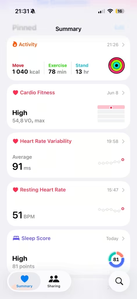
Open Health, in the summary section you see “Heart Rate Variability”. You’ll see 5 views: Day, Week, Month, 6 months and a year.


Day view shows scattered dots across the day. These are the passive automatic readings — ignore the individual dots. The number to note is the average shown at the top. Even that is rough, but it gives you a rough position for the day.
Week view is where the useful signal lives. You’ll see a bar for each day showing your range, and a line connecting the averages. Look for the direction of that line over 5-7 days. A gradual rise means you’re recovering well. A gradual fall means something is accumulating.
Month view shows your longer baseline. After a few months, you’ll see your normal range clearly. Anything well below that range for multiple days in a row is worth paying attention to.
6-month view starts to show seasonal and lifestyle patterns. If you’ve made a change — better sleep schedule, more consistent training, less alcohol — this is where you’ll see it reflected. The noise of individual days disappears and the real trend becomes obvious.
Year view is the clearest picture of your baseline. You can see how your HRV shifts across different periods of your life. A stressful stretch at work, a period of good training, a week of illness — it’s all there in the line.
One thing to note: Apple doesn’t draw you a trend line or flag when your HRV drops below baseline. You have to read it yourself. That’s why a third-party app helps — it does this analysis for you.
What to actually do with it
The problem with Apple’s HRV display is it gives you raw data without context. You get dots. No baseline, no trend line, no guidance.
Take a morning measurement. Passive automatic readings throughout the day aren’t reliable. The most consistent approach: each morning before you get up, sit still for 60 seconds. Being upright and at rest gives the watch the cleanest conditions to grab a reading. Whether doing a Breathe or Mindfulness session explicitly logs a new HRV data point is worth checking yourself — open Apple Health after a session and look for a reading with that timestamp. If it does, that’s your protocol.
Apple Health is enough to start. The week and month views give you the trend. A morning Breathe reading gives you the consistent data point. You don’t need anything else to make this useful.
If you want to go deeper, apps like HRV4Training automate the trend analysis and give you a daily readiness score. But that’s optional — most people get real value just from staying consistent with Apple Health.
Give it 3-4 weeks before drawing conclusions. Your baseline will emerge. Then the dips start to mean something.
The short version
HRV tells you how recovered your nervous system is. What you want isn’t a high number — it’s a stable, normal number relative to your own baseline.
The passive data Apple Watch logs throughout the day is noisy. A morning Breathe session gives you a reliable reading. Track it in Apple Health over weeks and watch the line. That’s when the number stops being confusing and starts being useful.